

Behind the Scenes: The All-Road Bike Revolution
For me as an editor, seeing a new book come out is a very special moment, especially if it’s a new and challenging project. Before I joined Bicycle Quarterly and Rene Herse Cycles, I edited more than 180 books and magazines, but our latest project, The All-Road Bike Revolution, has been one of the most unique books I’ve worked on. It’s not just a technical book, but one that describes ideas that have been discovered only recently. There is no precedent for this book, no experience to draw from.
When an author has a great idea, it’s the editor’s job to turn this idea into an actual book. My first question is: “What is the essence of this book?” And then: “How can we make this idea accessible to our readers?” The new book summarizes years of research into how to make bikes faster, more comfortable and more reliable. A book like that risks becoming academic, something that requires careful study and is often rather boring. How can we turn this into a book that is easy to understand and fun to read? Our goal is to show you the forest and not only the trees: The technology of bikes really serves to make cycling more fun.
What format will work well for this subject? Now is the time to establish the direction of the book’s design. Who will be our readers? What is the best way to illustrate the technical contents? Who will we ask to design the book?
At first, Jan imagined that this book would be like The Golden Age of Handbuilt Bicycles, a large-format book filled with many beautiful photos. As much as I love The Golden Age (I bought a copy of the Japanese edition long before I met Jan), it was clear to me that this wouldn’t work. The new project was going to be a book you’d spend a lot of time reading, so it had to be smaller and easier to hold in your hands. You might even want to read it on a train or bus on the way to work. We needed a completely new direction.
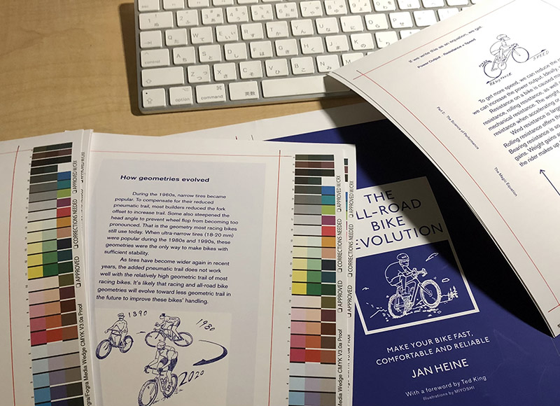
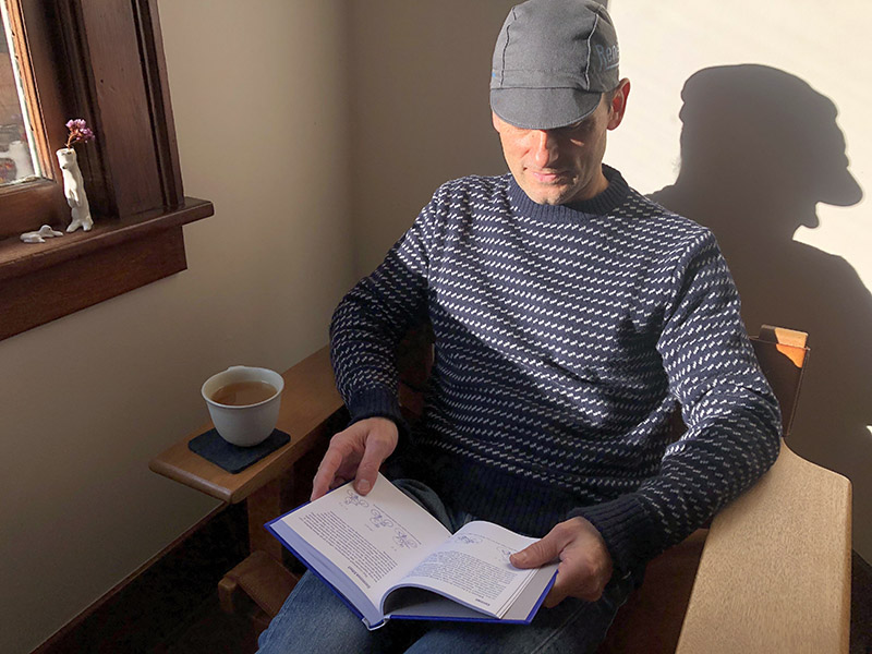
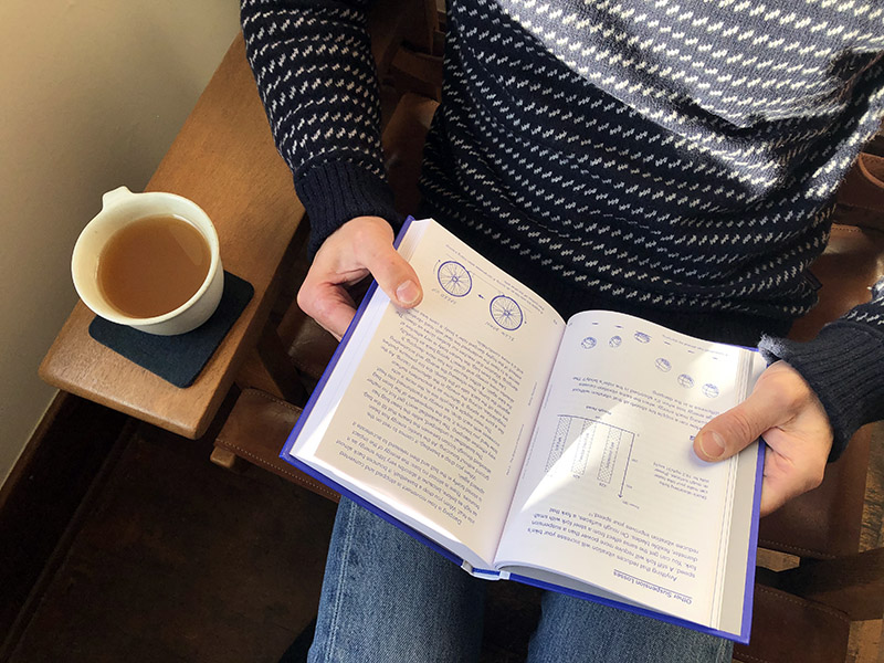
I also didn’t think photos could express the ideas. We were talking about technical things that you can’t see, like frame flex or rolling resistance, or that aren’t obvious unless you look very carefully, like how much a tire deflects on the road. In these cases, illustrations work well, because they can focus on the concepts we want to explain. Illustrations can remove the non-essential information that distracts the viewer. They can simplify and emphasize what is important to understanding the technical concepts that are explained in the text.
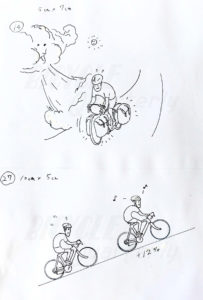
Who can make these drawings? Many of the book’s ideas are new, and nobody has talked about them before. This means that there are no examples to draw from, no existing illustrations that can serve as inspiration. And since it’s technical, small details are very important. How do you express crosswinds or planing in a drawing that helps readers understand the text?
I have to translate the author’s ideas for the illustrator into something that they can draw. I have to find somebody who shares the joys of cyclotouring and has the passion to understand what each drawing should express. They’ll have to work off rough sketches provided by Jan or me, or photos that I take of Jan on his bike.
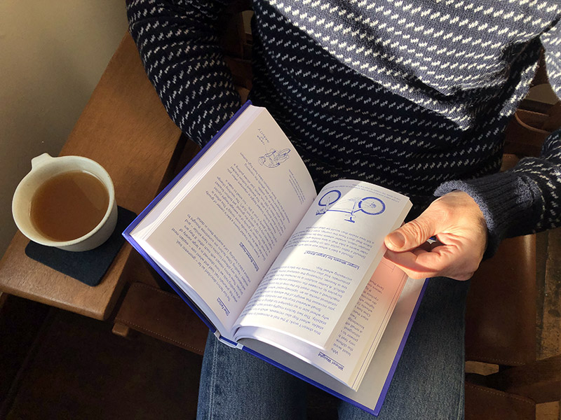
This was one of the most challenging parts of this book. We decided to ask Miyoshi, who shares our passion and knows our style of riding. I also like that he draws by hand, not digitally. Seeing a human handstroke is becoming increasingly rare, but for me it’s special. Even for Miyoshi, this book was a challenge, but he accepted to work with us. I’m very happy with the result. Miyoshi’s drawings are deceptively simple: They focus on the essential and clearly tell the reader what is important. And at the same time, they radiate the joys of riding a bike.
Then I had to choose the designer for the book. I don’t want this book to look like a textbook, which is something you read only because you have to. I want this book to be fun to pick up and read. The design has to be simple, so the reader can focus on the subject without distractions. The book’s contents is unique, and I want that reflected in the design. And since this book talks about the future of cycling, the design has to be contemporary.
I’ve been a fan of There There’s design for a long time, and I’ve worked with him on magazine projects in the past. He can visualize what readers will feel when they pick up the book and start reading. I also know he’s a really good art director. This is important because there needs to be a good collaboration between designer, illustrator, editor and author. There are some very new ideas in the design of this book (which surprised the printer), but it’s clean and easy to read.
Other parts of the team were our proofreader and our copy editor who suggested ways to make the descriptions clearer and easier to understand. We also got valuable feedback from technical experts like Gérard Vroomen of OPEN, and from riders like Lael Wilcox and Ted King, who wrote the foreword.
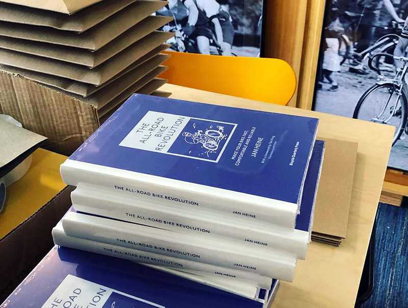
When all this comes together, and we finally hold the book in our hands, it quite a moving experience. And it’s even more fun when we mail out the books to readers all over the world. We imagine how they will pick up the book, start reading, smile when they see the illustrations, and find many interesting ideas among the contents. When we saw the first photos of the books pop up on social media, it made us happy. We hope the book will bring joy and excitement, both while you read it and when you ride your bike.
